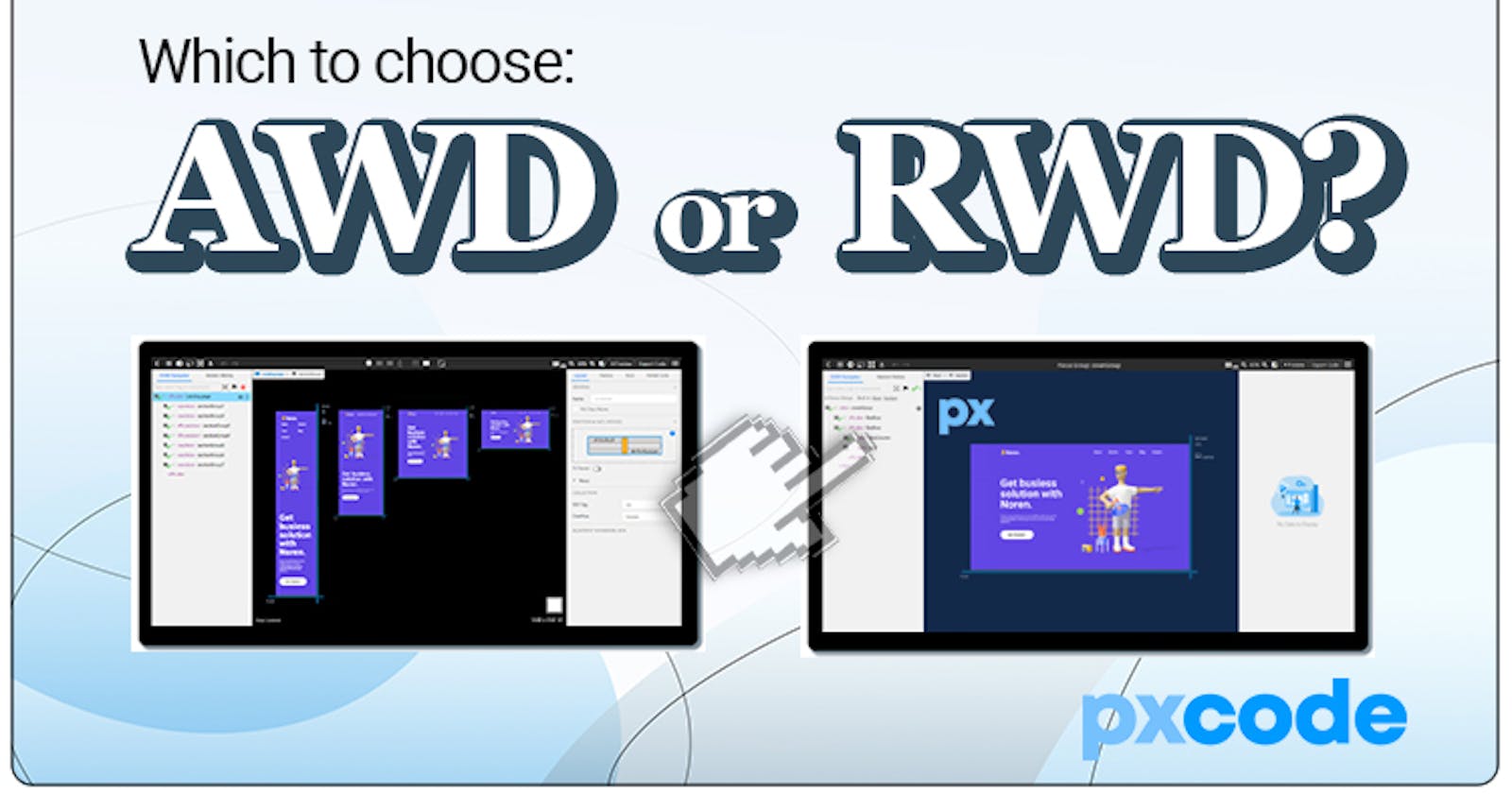
AWD or RWD: Why you should use RWD?
An old but confusing question, how can we decide what to use? "If time is money, choosing RWD can definitely save you ‘money’. "


First of all, to find out the answer, we should understand the difference between these two —— ‘The difference between AWD & RWD?’ Let’s have a simple answer with its acronyms.
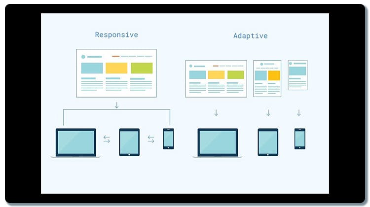
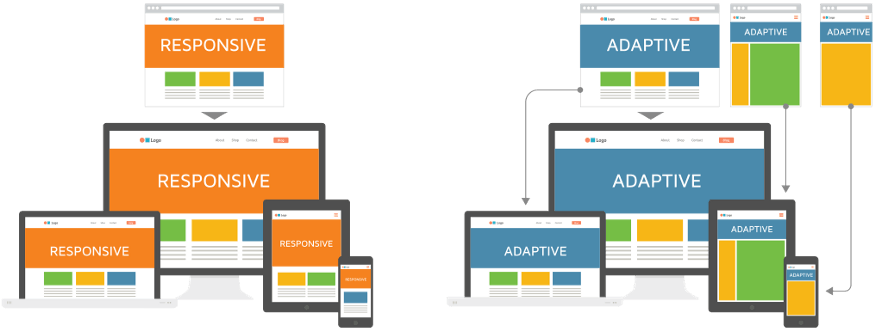
🟠 AWD is the acronym of Adaptive Web Design, 🔵 RWD stands for Responsive Web Design.
AWD 🟠
In other simple words, Adaptive Web Design(AWD) was designed to adapt different specific screen sizes, which you need to have a few layout designs in advance to achieve. Therefore, it has a different CSS Structure behind it.
RWD 🔵
While Responsive Web Design(RWD) was designed to fit in any screen sizes, so you only required one single design and one CSS structure for all. Besides, AWD & RWD both determine the screen size itself, and they both used only one URL Link. It may sound very similar, and in fact, it seems nearly the same on the results. Both of them adapt/respond to different Screen Sizes pretty well. Even the words ‘Adaptive’ & ‘Responsive’ both share a very similar meaning, quite tricky, but the biggest difference between them actually happens during the developer stage! But how ?
 credit: Arnav
In this article, we will dive deep to look into the difference between AWD & RWD in four major parts: 【Developing Cost】, 【Developing process】, 【Editing Result】 & 【Which to Choose】?
-
Developing Cost 💸
 Time is Money. Photo by Morgan Housel on Unsplash
For building a complete Website, coding from scratch is most of the time, the best and safest choice to do. But the main downside of it is the heavy load of developing cost.
Time is money, and with the intensively competitive market nowadays, money is more important than time. ⏳
For this specific and understandable reason, most of the company has been excluding the ‘Coding from Scratch’ way to build a Webpage, it’s obviously because considering the huge developing cost. That’s when AWD/RWD comes to replace. To save precious developing time, and focus mainly on the results.
-
Developing process ⌨
The developing stage is when AWD & RWD meets the biggest difference. As AWD, it required different layout designs to adapt different screen sizes, therefore you need different layout designs to achieve.
But with RWD, you only require one single design to proceed. In this case, RWD saves you plenty of time during the developing stage. If time is money, choosing RWD can definitely save you ‘money’. 💵
Now let’s see the difference between AWD & RWD during the developing stage.
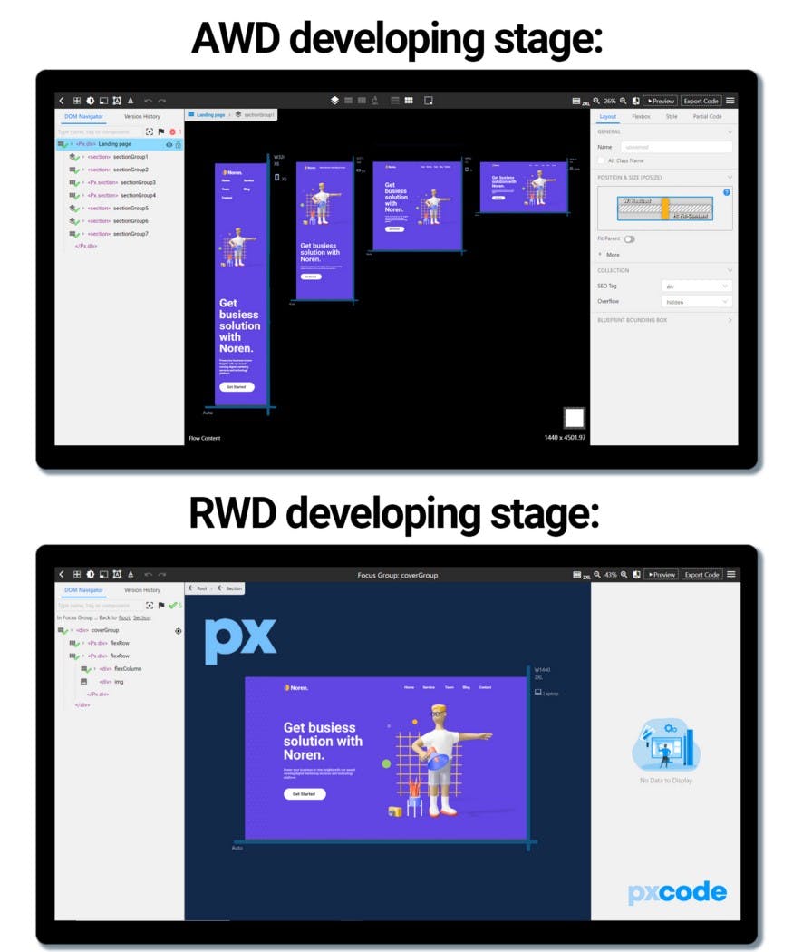 Difference between AWD & RWD during development. ↓ Below is pxCode’s editing canvas
-
Result 📲
How about the results? What does the difference AWD & RWD makes during the final Web Design? Instead of using words to describe, it’s better to let the picture speaks.
As you can see, the results of both are nearly the same. They both perform pretty well on the final Webpage. But, here comes the question:
-
Which to choose? 🧐
Obviously, AWD & RWD are not co-existential. So as a developer, we have to decide one among two, but which can make the best results for your Webpage? The answer is: It depends. But, we recommend RWD. 👊
Generally, if your Website is simple and minimalist, RWD is definitely the best way to go, you can build it within a very short time, and all the components can works smoothly in the RWD mode. Overall, RWD is the faster and simpler choice. Furthermore, during the post-editing, RWD only required to fix once on the CSS code, while AWD has different structure to be edit.
On the other side, SEO plays an important role on Website. RWD is Google’s recommended approach for mobile web design. Per Google, responsive websites will perform better in search rankings because they provide a better user experience than sites that are not mobile-friendly. 📲

That’s why we recommend develop a Webpage with RWD. But how? That’s the reason why we are here for you! pxCode is a tool to helps you convert Design into Code, while export as Responsive Webpage with HTML/CSS/React code auto-generated for further integration.
Why don’t give it a try? Check out the tutorial here for more details. 👈

We’re excited to hear your feedback! Feel free to comment for any questions or tutorial requests! 🤓
📝 Try pxCode: pxcode.io 🟦 Facebook: facebook.com/pxCode 🐦Twitter: twitter.com/px_code 🔻 Youtube Tutorial: Playlist